Skip to content
ShovelstoneLet's talk ↗
Menu

Jiffy makes notes, tasks, and reminders feel almost frictionless.

This product showcase highlights how Jiffy turns messy note-taking and schedule management into a fast, conversational experience. The goal was not to add more features. It was to remove the tiny bits of effort that make people abandon the tools they already have.

AI-assisted capture without workflow clutter
Natural-language reminders that feel instant
Shared spaces for families, couples, and teams
Jiffy App Store artwork showing notes, tasks, and reminders
Platform
iOS and Android
Category
Notes, reminders, shared planning
Positioning
Simple enough for daily use, smart enough to save time

A showcase built around real screens, not generic marketing boxes.

The App Store artwork pairs current app screens with a concise description of each workflow. Each section keeps the full image visible alongside the product idea it supports.

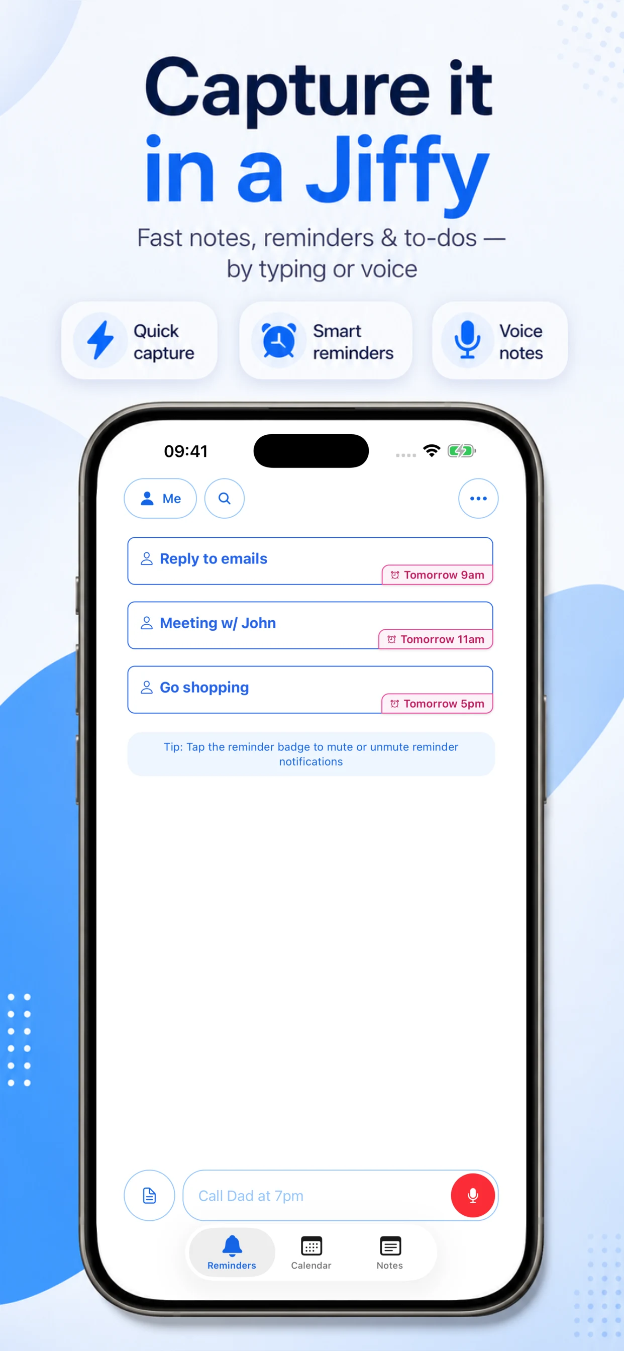
Jiffy App Store artwork showing the home screen and upcoming reminders

Design a reminders app for people who hate admin.

Jiffy is for people who do not want to maintain a system. They just want to write down what matters, when it matters, and trust the app to handle the structure. The product direction focused on reducing setup, reducing taps, and reducing decision fatigue.
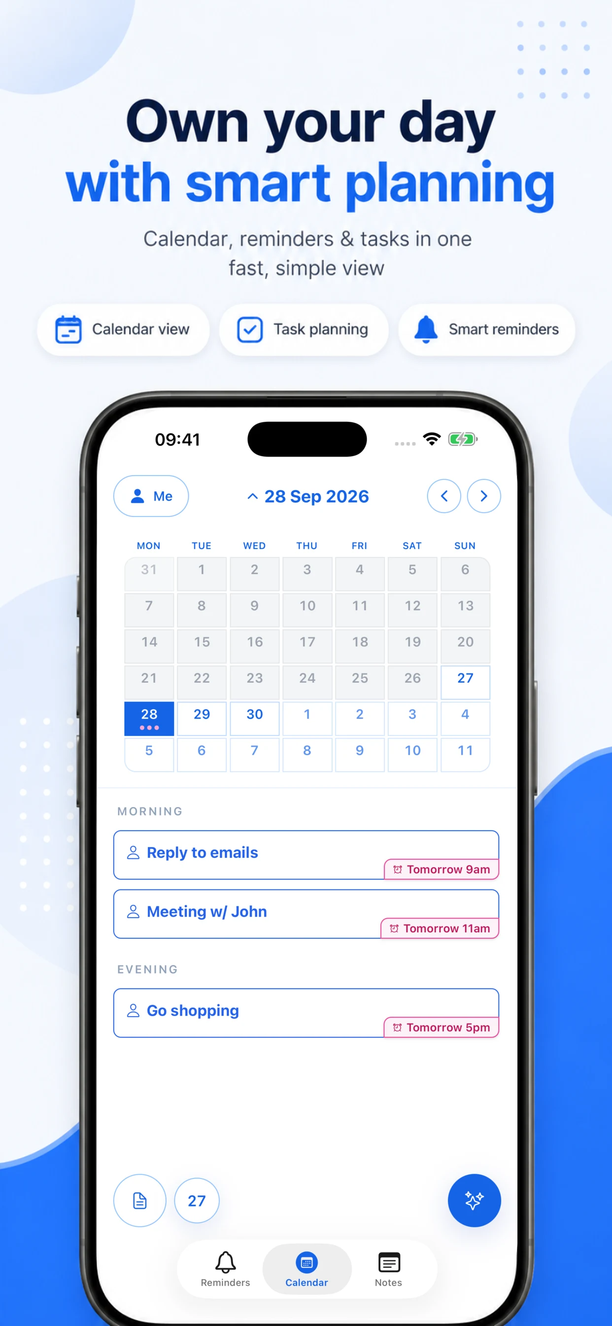
Jiffy App Store artwork showing the expanded calendar and scheduled items

Natural language replaces calendar chores.

Instead of forcing users through forms, pickers, and nested flows, Jiffy lets them type requests the way they naturally think: ‘Doctor appt on the 22nd at 11.30am’. The app interprets intent, extracts timing, and turns it into a reminder with far less friction.

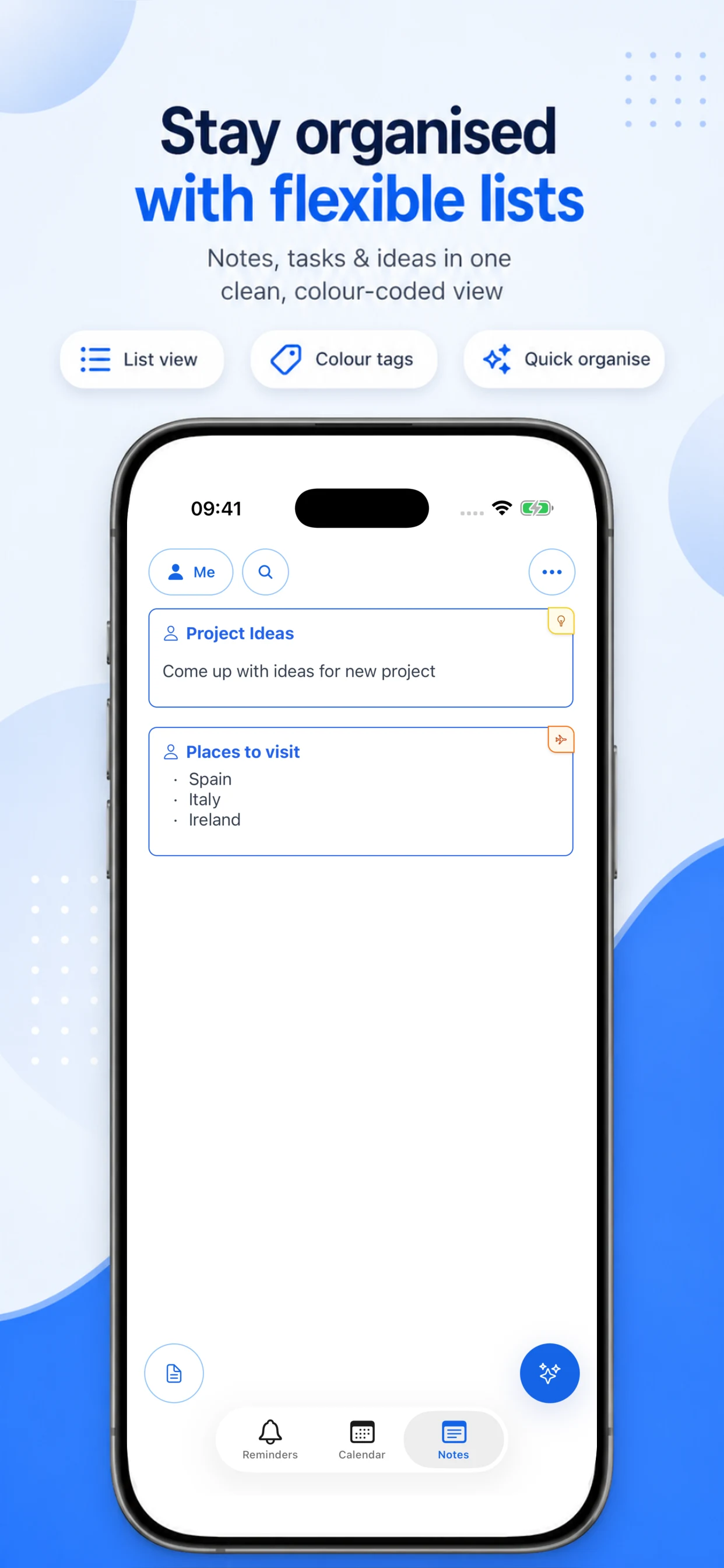
Jiffy App Store artwork showing the notes list

The UI stays quiet so the content can do the work.

The interface takes cues from the most familiar conversational products: clear hierarchy, generous spacing, and obvious next actions. That gives Jiffy a low-learning-curve feel while still supporting notes, tasks, reminders, and AI-powered actions in one place.

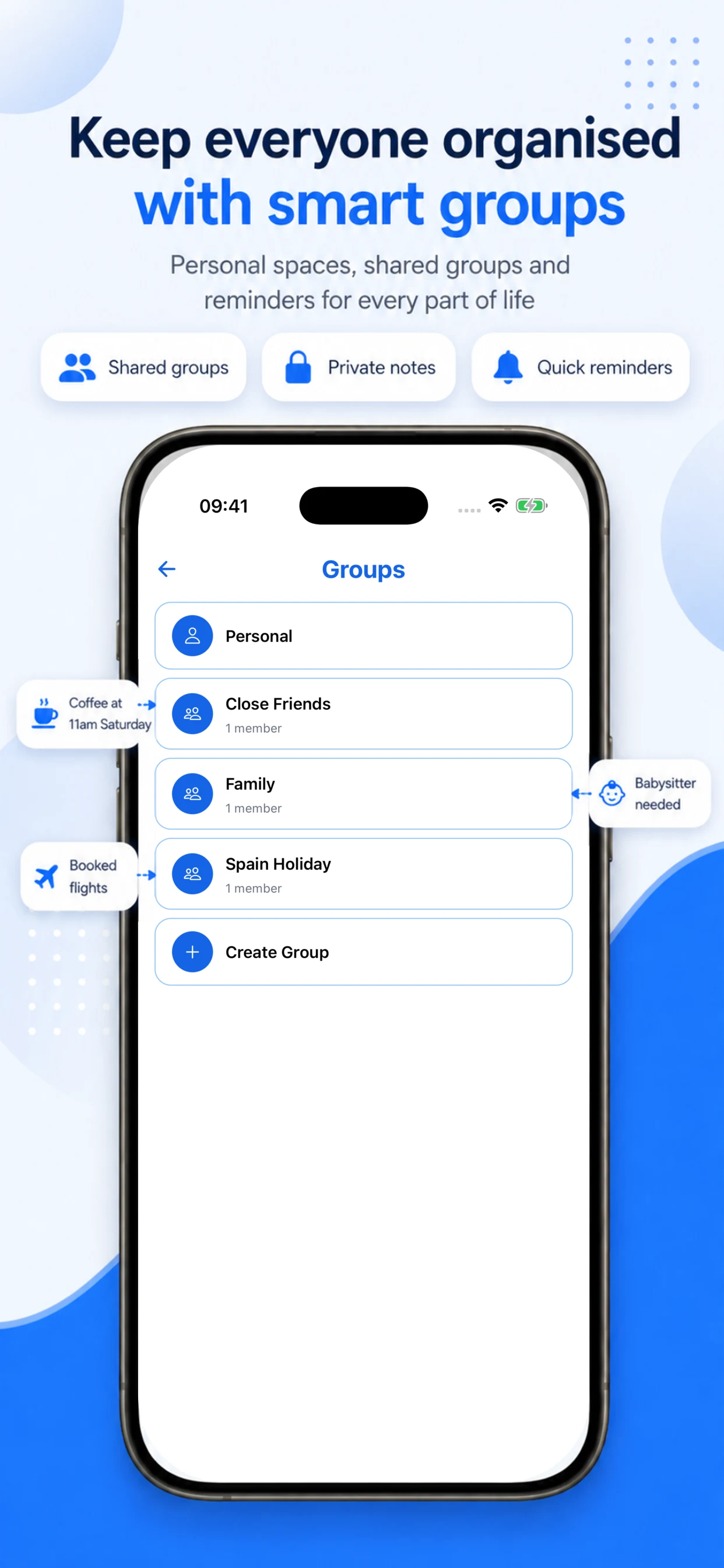
Jiffy App Store artwork showing shared groups

Shared calendars and notes without the usual mess.

Jiffy groups create a lightweight shared space for families, couples, friends, and coworkers. Notes, reminders, and events can live together in one context, making coordination feel simple instead of fragmented across multiple apps and message threads.

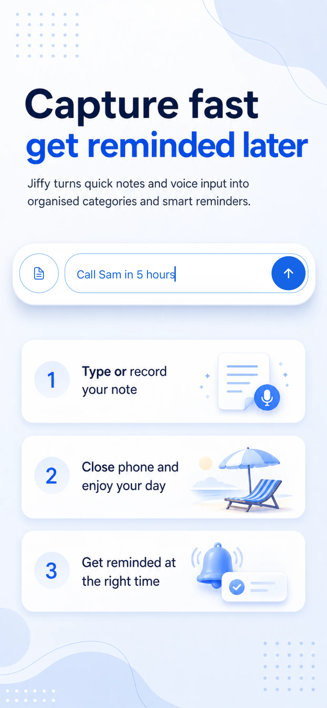
Jiffy App Store artwork showing quick capture for ideas and reminders

Feature velocity matters less than feature taste.

Modern tooling makes shipping easier. The harder problem is knowing what should exist at all. Jiffy reflects a deliberate product point of view: fewer noisy features, tighter defaults, and a stronger focus on clarity over novelty.

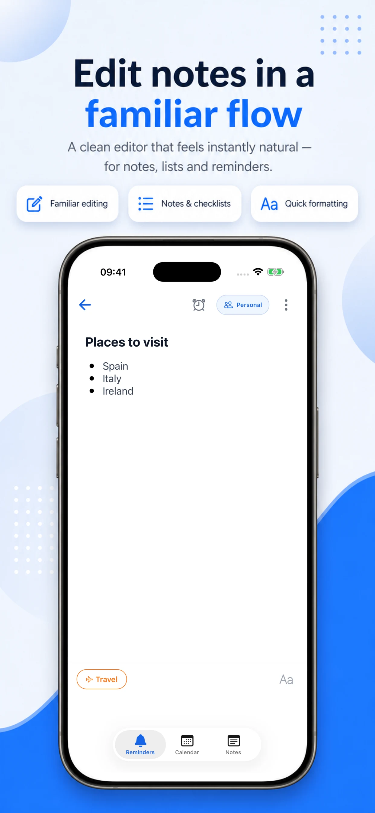
Jiffy App Store artwork showing the note editor

Familiar enough to trust, refined enough to feel better.

Jiffy avoids reinventing every interaction. Instead, it improves familiar patterns with more precision and less friction. That makes onboarding easier for users coming from existing notes and reminders tools while still giving the product a distinct point of view.

Jiffy is a case study in restraint.

The product is strongest where most productivity apps overcomplicate things: capture, scheduling, and sharing. By keeping the interface familiar and the interaction model conversational, Jiffy creates a calmer experience for users who want help staying on top of life without having to become power users first.